

Et Tu, Urban Institute?
NGO suggests EdChoice voucher students have better college attendance and graduation rates, then admits the data can't be applied to today's program, even though they know people will do just that.

Ok. Look. I’m no statistician. But if I’m putting out a report with the intent of addressing an ongoing, universal school voucher program and its “success”, I would certainly want to talk about the “success” it’s having today, not the “success” it had 11-18 years ago, right?
But that’s not what a new Urban Institute study does. Let’s look at what it does do, shall we?
They look at EdChoice Voucher data from 2007-2008 to 2013-2014.
Then claim that they can figure out who voucher and public school kids are taking state proficiency tests (even though all state data on testing is anonymously reported).
Then they claim they can figure out how these voucher students completed college in National Student Clearinghouse data.
They then claim they can make meaningful performance comparisons by selecting Voucher and public school kids — again, whose specific state testing performance is anonymously done — based on matching “each EdChoice participant to nonparticipants with similar prior test scores, demographics, and attended schools using propensity score matching” — a method they admit cannot eliminate the fact that “voucher participants are differentially selected on unmeasurable characteristics.”
But don’t worry, they assure us, this methodology “reduces that concern.”
They then arrive at about 1,600 students for comparison — a quite small proportion of overall Voucher recipients. Between 2007-2008 and 2013-2014, on average, 3,900 or so new vouchers were used. And in 2013-2014, 17,000 total Vouchers were used. So the number of recipients they’re actually examining represent a very, very small proportion of the overall Voucher population — less than 10% of the annual number of recipients at the time and far less than that if you count all Voucher recipients during that 6-year period.
They also use famously problematic Performance Index Score data to serve as a type of “control” for their test score analysis, even though PI data applies only to school district and building proficiency test results, not individual student scores. And they took the school’s second-best PI score to do the analysis. Why not the best? Why not the third best? Because second best.
They then claim that their data analytics get them to conclude that voucher recipients graduate and attend all types of colleges at much higher rates than public school students.
All based on students they can’t identify through similar state data who would be 30 years old now.
Look. I’m a fan of historical data. I like to use it to see where we’ve been, where we’ve come and where we’re going.
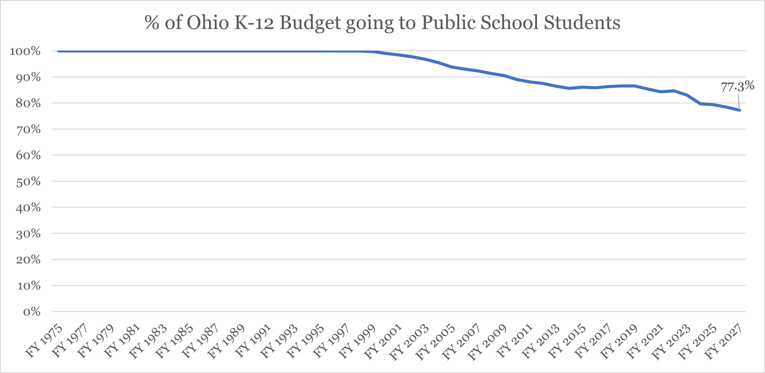
For example, here’s an historical chart showing how much taxpayer money has been and will be diverted from Ohio public school students to instead subsidize private school tuitions for mostly wealthy adults.

Likewise, here’s a chart showing how Voucher students perform worse on state tests the longer they take a voucher.
Oh yeah. One more. Here’s the percentage of state funding going to the 85% of Ohio students who attend Ohio’s public school districts over time thanks to school choice privatization efforts like vouchers.
But the Institute’s choice to do this wildly speculative study knowing that the state of Ohio’s current voucher system is vastly different today than the one they analyzed from 11 to 18 years ago is at best ignorant or naive and at worst irresponsible.
Ohio has tracked public school student college matriculation for years. But we didn’t know the demographic or other breakdowns of these results. For example, we know that between the class of 2009 and 2014, Akron’s college graduation rate jumped 30%, Cuyahoga Falls’ jumped nearly 40%, and extremely poor Jefferson Township in Montgomery County’s jumped 116.4%.
But we don’t know how much it jumped for poor kids, minority kids, low standardized test scoring kids, special needs kids, etc. We only know that much larger percentages of kids in these communities completed a college degree within 6 years of graduating between 2009 and 2014.
Importantly, we know none of this same information about Voucher students.
The Urban Institute, though, tried to then extrapolate this very barebones data — data that, again, does not exist in the same form at the state level for voucher students — into a meaningful comparison using an entirely different dataset for voucher students.
Because. Again. The state does not track college matriculation for voucher students the way it does for public school students.
The Urban Institute simply cannot do this with any confidence, especially as it concerns the state’s current EdChoice regime. Remember: the study does not include data from the period after the state started its massive voucher expansion in 2014.
And the authors admit — to their credit — that the current state of Ohio’s voucher program makes it nearly impossible to extrapolate their findings to the current program.
Which pisses me right off.
The Urban Institute isn’t stupid or naive. They have to know that voucher advocates will make these extrapolations during the state’s budget season. No one will pay attention to their CYA caveat, and their report will clearly be used to justify huge new diversions of taxpayer dollars from public school students to private school parents and adults.
Be that as it may, here are the researchers doing the ass covering they know will never stop voucher proponents from doing the very thing the researchers say can’t be done.
“Another important limitation of any study that examines long-run outcomes is that the results necessarily reflect the conditions of the voucher program at a previous time, rather than the voucher program as it currently exists. In this case, the most recent EdChoice participants included in the analysis joined the program more than a decade ago when it was still largely targeted to students at low-performing public schools. As a result, the findings might not accurately forecast the impacts of newer programs that are open to all students and include expenses other than private school tuition (e.g., education savings accounts).”
Here’s an interesting tidbit, though: EdChoice in 2013-2014 was doing what it always has done — subsidize private school tuitions for wealthier, whiter adults than the districts those students were leaving. So wouldn’t you expect the kids of these adults to be more likely to attend and complete college (Hint: the answer is, “Yes”)?
Let’s drill down a bit, shall we?
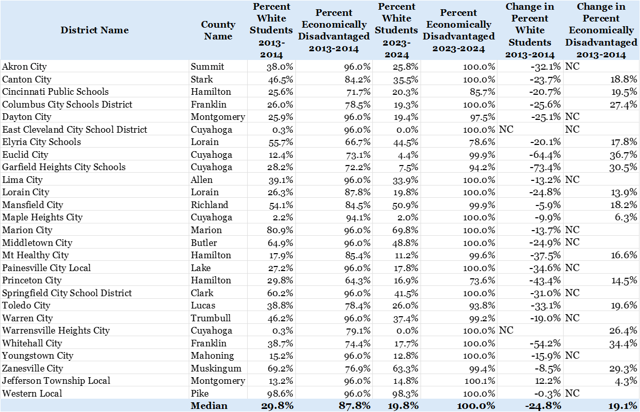
In the 2013-2014 school year, only 27 school districts lost money and students to EdChoice tuition subsidies1. The median percentage of white students in those 27 districts was 29.8%2. Those districts’ median percentage of economically disadvantaged students was 87.8%. Meanwhile, only 35% of students receiving a voucher in the 2013-2014 school year were white and 32% were low income.
So because the overall populations here are so different demographically, in order to do a fair comparison of like students in vouchers and school districts, you’re going to have to first make sure that they weren’t students who were never in the public schools to begin with — a large percentage of Ohio adults taking vouchers, even in 2013-2014.3
Then you’re going to have to look at two very different student populations and compare like populations using anonymous testing or demographics data from different sources and run it through some statistical testing and things like “propensity score matching” in order make a sweeping conclusion that could have a devastating effect on the communities the Urban Institute historically has cared about.
How devastating?
Try this on for size.
The median percentage of white students in the 27 EdChoice districts in 2013-2014 was 29.8%.
Those same districts today?
19.8%.
That’s right. That’s a 33% drop in White student enrollment in these voucher districts over 10 years.
Some districts’ drops were extraordinary. Garfield Heights, for example, went from 28.2% White to 7.5% White — a nearly 75% drop.
At the same time, the percentage of Economically Disadvantaged students in those districts jumped by more than 19%.
Garfield Heights went from less than 3 in 4 students being economically disadvantaged to, for all intents and purposes, all students being so designated.
What changed?
One Big Thing: Voucher enrollment.
In 2013-2014, there were 17,076 voucher recipients in those 27 districts.
In 2023-2024, there were 40,315 voucher recipients in those 27 districts.
That’s a 136% increase in 10 years.
Another way of looking at the overall comparison: There were more voucher students just in Cincinnati and Columbus last year than there were in all 27 EdChoice Voucher districts for the 2013-2014 school year.
Garfield Heights (just to tie that bow) had 38 EdChoice recipients in 2013-2014. Ten years later, that number exploded to 547 — a 1,338% increase in a district with 2,700 students (down from 4,100 10 years ago). The district’s percentage of students designated economically disadvantaged jumped by more than 1/3 from 72% to 94.4%.
Finally, let’s just assume for the sake of argument that the Urban Institute is absolutely correct about the college thing they just put out (which is extremely dubious).
I wonder if the Urban Institute looked at this report through the lens of its “Impact Objectives”, which are the following:
Increase upward mobility
Create communities of opportunity and shared prosperity
Build a fair and just society
Improve people’s well-being
Promote effective use of resources
I fail to see how watching communities become significantly poorer over 10 years increases upward mobility.
I fail to see how increasing racial segregation in communities create communities of opportunity and shared prosperity.
I fail to see how increasing racial segregation in communities while making them poorer builds a fair and just society.
I fail to see how watching significant numbers of their White peers leave their classes improves the well-being of the students left behind.
And finally, I fail to see how investing $1.2 billion a year into a program whose spending has never been publicly audited promotes an effective use of resources.
Did the Urban Institute even know this was the result of EdChoice in Ohio?
Who knows.
I would sure like to ask the Urban Institute, though, this bottom line question: Are these dubious college results worth creating state-sponsored school re-segregation, and entire districts filled with nearly all economically disadvantaged students?
Certainly worth asking, don’t you think?
I mean, I’ll ask you, Dear Reader.
Is it worth it?
The 2013-2014 school year was the first year of the EdChoice Expansion program, but only had 1,057 students in it. So I’m just sticking with the original EdChoice program, which the Urban Institute also seems to have done.
One district — Western Local was 98% white in the 2013-2014 school year, which increased the average percentage among those 27 schools by 10 percent from 25% to 35% White. So I went with median to offset that outlier. Only 1 student took a voucher from Western Local in 2013-2014. More than 17,000 EdChoice vouchers went out that year. So having them so severely tilt the data, I felt was unwarranted.